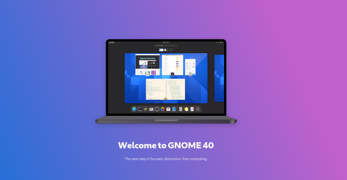
GNOME is one of the most popular desktop environments out there. While many people have a love-hate relationship with the same, it powers most popular distributions like Pop!_OS, Ubuntu, and Fedora. The new version of GNOME, i.e., GNOME 40, was one of the most awaited releases in the Linux community, and you can finally try it thanks to Red Hat releasing its Fedora 34 Beta with GNOME 40. In this article, let’s look at the latest changes and GNOME 40 features. Let’s get started.
GNOME 40 Features, Changes And Improvements
App Icons
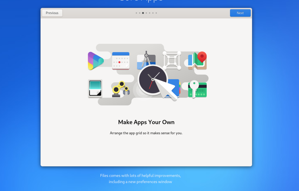
The official GNOME 40 website terms this release as “The next step in focused, distraction-free computing.” The icons have been completely revamped and look a lot minty with vibrant colors with more curved radii.
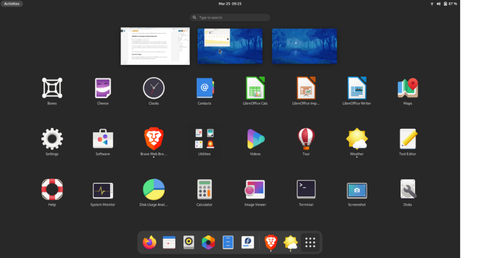
They remind me of Deepin’s icons, with the only difference being the slight curvatures on the edges and a little more character to the internal icon shapes. They also look a lot minimal and are not overly done, which I really like.
Overall, they give quite refreshing vibes for someone like me who has been using GNOME for a long time.
App Dock Changes
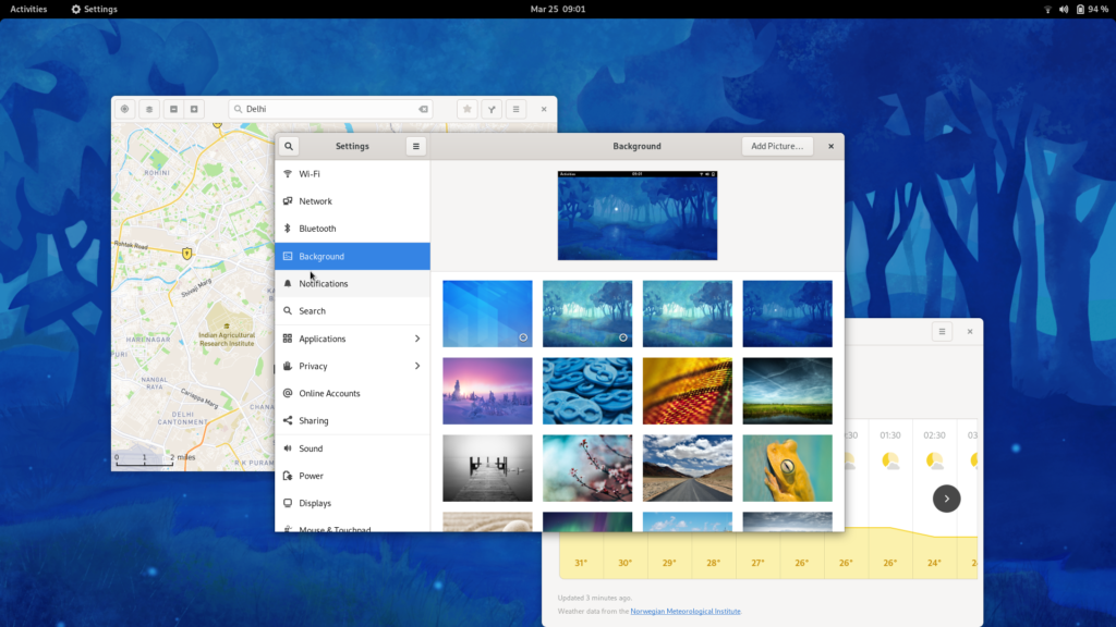
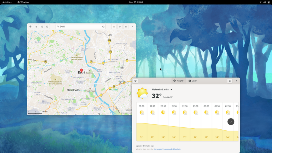
We’re used to seeing the ol’ default dock on the left side of the screen in GNOME but, this time, as soon as you log in, you’ll be greeted with a clean desktop displaying just the wallpaper.
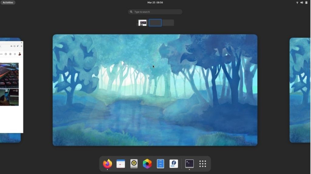
To peek at the dock, you’ll have to click on “Activities” on the top right corner of the screen. Along with that, you’ll also be able to see the workspaces, which you can now switch between, instantly thanks to the trackpad gestures, which we’ll talk about later.
The dock also now has a thin separating line that differentiates your favorite apps and the apps you’ve opened, which are not your favorite similar to what we find on the iPadOS.
Also Read, What’s New In Fedora 34 Beta Release?
I really like how the workspaces flatten even more when you click on the “Show applications” icon. Sure it’s not a big deal but, subtle details do matter. As someone who’s used to the Dash to Dock extension, it took me some time to get used to this, but I’m sure the same will be available for GNOME 40 as soon as other distributions start adopting it.
Workspace Gestures
I’m used to working with vertical workspaces but getting used to the newly introduced horizontal workspaces would take a lot of time.
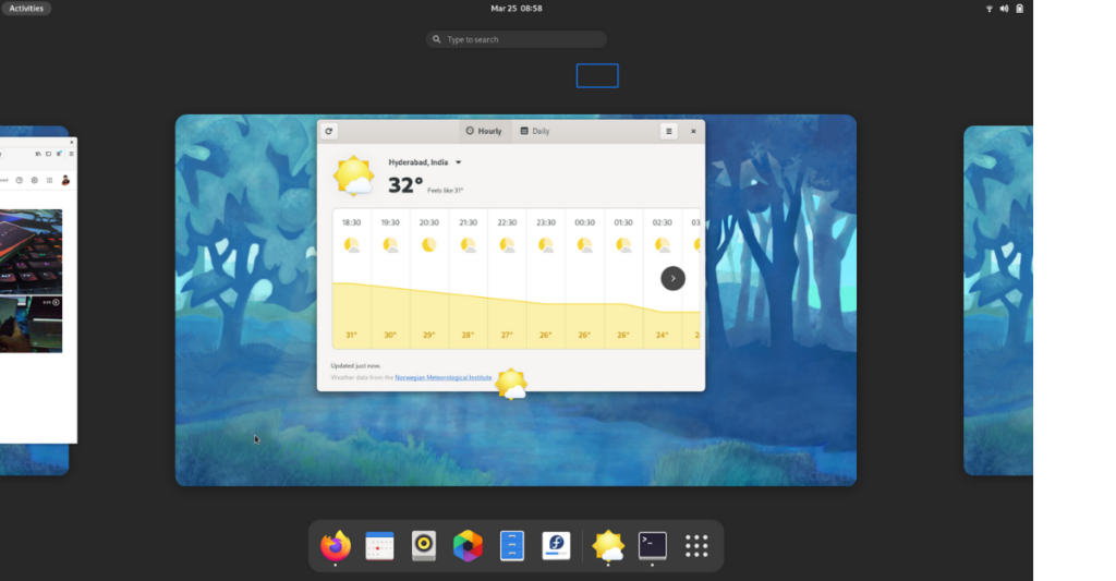
Either way, I like the three-finger gestures and find it a lot intuitive. This also saves a lot of time and effort. Swiping up with three fingers reveals the favorite apps dock, and doing the same once more shrinks the workspaces and reveals the apps.
Similarly, you can swipe left or right from any app to switch between workspaces using three-finger gestures. You can also do the same by holding the Super + Alt keys, using the side arrow keys, and holding Super +Alt and the scrolling wheel.
Revamped GNOME App Designs
GNOME apps were already great, to begin with, but this revamp takes them to the next level. They’re visually appealing yet minimal. Overall, the apps look great.
The files app (Nautilus) comes with default options to select to modify your preferences and return desired results.
Similarly, the Web app (Epiphany) gains new features like pinned tabs, unread indicators, and many more. The place bubbles on the new Maps apps look great as well.
GNOME 40 Other Features
Some of the other minute features worth mentioning are; the compose key using which you can easily use special characters like  , ½, and ℃. The Wi-Fi interface now finds the most relevant Wi-Fi networks first. Browsing and searching the keyboard shortcut settings is also easier now.
As of now, you can experience GNOME 40 in Fedora 34 Beta. Since GNOME 40 is based on GTK4, all the GTK apps need to be adapted, which is a challenge. Hence, it’ll be interesting to see if other Distro communities would really adapt to GNOME 40.
When you put yourself in the developers’ shoes, building apps again for GTK4 just because of visual changes doesn’t seem rational at all and is a lot of work, to begin with. Let us know your thoughts in the comments down below.
What do you think of these new GNOME 40 features and GNOME 40 in general? Are you satisfied with the release, or were you expecting more new features and improvements? Do let us know in the comments section below.
The post GNOME 40 Features Overview In Fedora 34 Beta — What Has Changed? appeared first on Fossbytes.
from Fossbytes https://ift.tt/31kSypj
via IFTTT

No comments:
Post a Comment